10.31.2011

LEAVE A COMMENT TO WIN our kit of the month

Photobucket
And I will pick a winner next week.
HAPPY HALLOWEEN EVERYONE!!!!

10.29.2011

SUPER cool misting!!!

Happy October everyone! I hope you're enjoying this wonderful time of year. I for one, love fall. And for us, that means Halloween costume time. It's so much fun for the kids to get to dressed up and it's a day all about them. Here's a layout I created about my daughter's first Halloween costume; complete with a fun how-to.
For my technique this month, I am going to share how to create a bold title using mists and chipboard letters as masks.
I used the Chip Art Chipboard Shapes: Big Alphabet Set. Love this font!
Photobucket
In my spray box I laid out the letters and used scrap paper to create a square around them so I could use a variety of colors.
Photobucket
Don't worry if that over lap a bit. That's the fun of mixing the colors.
Photobucket
And all of them finished up...
Photobucket
I wanted the "letters" to stand out a bit more, so once it was dry I used the chipboard letters and traced them with my journaling pen...
Photobucket
Doesn't that just make them stand out so much more?
Photobucket
And now that I have a fun base for my layout, it's easy to create the rest!
Photobucket

Photobucket
Have fun and Happy Creating!
Photobucket

Megan Klauer
meganklauerphotography
meganklauerdesign

10.27.2011

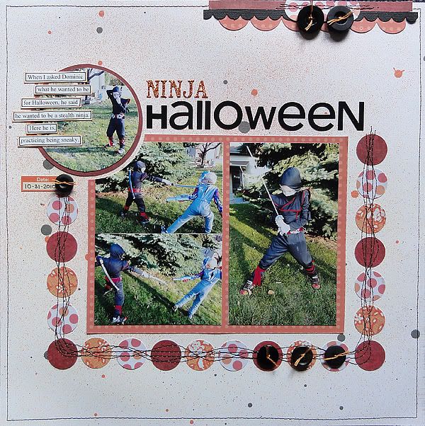
A Ninja Halloween

I pin on Pinterest and love the inspiration that I get from it. Sometimes I wonder how to translate that inspiration into a scrapbook layout. Here's one thing I did.

First, the pin from Kathleen Rogers:


SO adorable. However I found myself drawn to the cupcakes more than the flags. (Maybe I was hungry!) So I took the inspiration and created this layout:


I have the orange in the center (the pumpkin in the pin), circles (cupcakes) surrounding it, and "sprinkles" of mist all around the outside.

Here's the papers I used:

First, I used some red papers from Elementary, My Dear.

Next:


Trick Pony from Funhouse


Sunday Morning from Youthful Eggsuberance

A couple things I did to finish the page:


I stitched the circles down with a couple straight stitched, then I slowly swirled a few more stitches around the straight stitches.


And to add one more photo, I trimmed it into a circle, then cut a slightly larger circle out of the photos block to house it. I lay the journaling on top of it.

I enjoyed using this pin, not to recreate the actual craft but to take its inspiration to create an original layout. I hope you go use those pins to make a page!

10.26.2011

Look our for that Spider Web!!!

Hello everyone! Halloween is one of my favorite times of the year. Not only is it fun to dress up but I also love all the yummy Halloween candy you can buy. Since we are on the topic of Halloween, I am going to show you a quick and easy way to add a spider web to your layout.

First you will need a sheet of cardstock. Lightly draw a spider web on your cardstock with a pencil.


Next spray a little bit of mist before tracing the pencil lines with a black pen. After everything has dried, gently erase any visible pencil marks.


The last thing you will need to do is to cut around the outside of your spider web and adhere it to another piece of cardstock or patterned paper. Viola! A super easy and fun spider web. I hope you enjoyed this little tutorial. Here is what the finished product looks like.


Supplies:
Soul Food Brave Soul
Sweet Surrender Envelope Cards
Sweet Surrender The Little Lovebirds
Elementary My Dear Paper Pack

Happy Creating!

10.25.2011

Getting Crafty with Mosaic

Hi everyone, Agustina here! This was my inspiration for this month:

I love mosaic, but I never thought of making one into a card.... until now (:
First I drew the heart on the card, applying tape to all the areas and then.... just had fun with little papers (using the Soul Food Collection) and different kinds of sequins!
To add the -final touchs- with the back of a paint brush and some white paint, I made dots all around...
And... the final card:

Now, I hope you try this fun twist to mosaic work. Have a nice day!

10.24.2011

Wedding dresses and flowers

Who would ever think that wedding dresses and flowers could work for October? But, with warm beautiful colors like these they fit perfectly. For this color inspiration I asked Megan and Kay to create a layout with it and wow... they went above and beyond. Up first we have...

Photobucket

Megan:
Sometimes I start with an inspiration piece and even though it gives me a creative jump start, it often takes off in a completely different direction.

The color orange is what jumped out at me first and of course with it being October, I thought pumpkins! So, I pulled a photo from one of our past trips to our favorite pumpkin patch and began the creative process.

When I'm trying to stick to a specific color combination, I love to pull out my scrap drawer and grab those certain colors. It doesn't matter the theme of the paper or the design, we're strickly looking for color here. Sometimes going outside of the box is fun, ya know?
So here's what I came up with...

Photobucket

{Remember at the beginning I was talking about taking that inspiration in a completely different direction? Well, I ended up swapping out the green for a turquoise and that's okay! It's all about the creative jump start!}
I'm also one who very rarely throws away any scraps. I try to keep everything incase I can possibly reuse it later. Like this piece of the chipboard here...

Photobucket

Photobucket

It was originally from the RV There Yet - Layered Chipboard Stickers - The Great Outdoors Collection by Heather Tozzi. I had used the bottom half on a past layout. So save those pieces, you just never know when you might use them!
Those
Woodgrain Alphabet Chipboard Stickers - The Great Outdoors Collection by Heather Tozzi
may be my all time favorites! Woodgrain....swoon!

Photobucket

Where does your inspiration take you? Are you one to stick strictly to the theme & colors or do you find yourself heading in a different direction at times?
Happy Creating!
Photobucket

And here is Kay's beautiful:

I am in love with grey, and with these colors? SWOON-WORTHY. Here is my page:

Inside

Papers and embellies are from GCD Studios- From the Soul Food line; Soul Petit Orange Paper; Funky Soul Paper; Beautiful Soul Paper; Transparent Shapes; From Homespun Chic; Die Cut Borders; Homespun Mod Flocking Paper

Photobucket


I love how they made these colors so light and airy and I love how they can work for Halloween theme or a girlie theme. We hope you enjoy this fun and fresh color combo this week.

~H
10.23.2011

Triangles oh my!

Wanna see a yummy pic?


Told ya it was yummy. ;)
Besides being a very delicious looking picture, it's also very inspiring - just look at those fab napkins, and the fun color combo! I decided to make a card and envelope inspired by this trendy photo....


Love the mat (?) that the napkins, berry and bowl are on, so here's my take on that....

And the envelope (inside)...


Front....


See the brown pattern I have on the front of the envelope? I'll show you how I did that here...
(I did this same technique on the kraft cardstock on the card, but with Versamark ink, which is what I'm using in the photos)

Ink up tag....


Quickly press paper to tag...


And oila! Your own canvas like 'stamp'!


I hope you'll give this technique a try - I'd love to see what you come up with!


Blog: bearydocardsinc.blogspot.com


*************************************
Jungle
Butterfly Border
Little Leopard, Pink
Fauna Stripe, Pink
Garden Mix
Giraffe Border
Fabric Travel Tags

10.22.2011

rich blue and typical autumn colors = a fresh combo

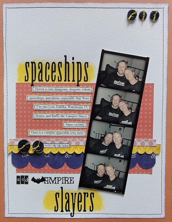
Now that autumn is fully upon us here in Minnesota, I am fully ready to scrap the lovely rich colors of the season, not just on outdoors layouts, but anything that makes me feel warm and cozy.

Here's one of those subjects: my husband. We've been together for many years now, and he is my rock.

The other day I noticed we were both wearing similar shirts that reflected our interests, in his case his favorite activity, Dungeons and Dragons, and in my case the best TV show ever, Buffy the Vampire Slayer. That inspired me to take some photos of ourselves, which my husband tried to sabotage a bit (see photo three below).

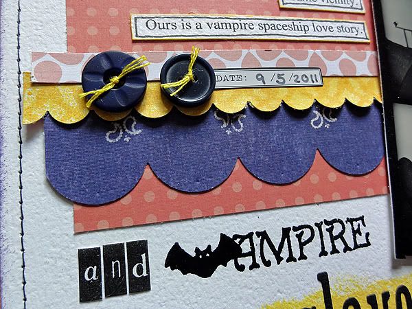
I used a digital photo strip frame from Fei-Fei's Stuff to house all the photos we took, and then I made this layout:

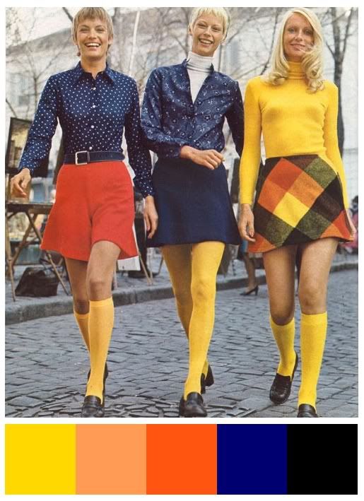
I was inspired by this color combo:
The bit of rich blue makes the typical autumn color combo fresh to look at.

I used the following GCD Studios papers:

Bandana from The Great Outdoors

Garden Mix from Animal Crackers for boys

Trick Pony from Funhouse

Lovely Garden from Soul Food

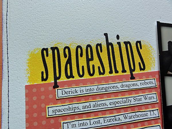
And just for fun, I stamped and embossed part of my title and painted behind the die cut letters:


Enjoy using this cozy color combo to scrap something that makes you warm inside!