4.30.2012

Sweet Tooth Week- Say Happy Birthday with a card

Tracy Schultz GCD

Hi there! It's Tracy here today, and I'm so excited to have my first post here on the GCD Studios blog. What an honor! This time of year is a really busy one for me birthday-wise, and the Sweet Tooth collection is absolutely perfect for making birthday cards. [Which is great, because I really do need quite a few!]

  Tracy Schultz GCD

 I fell in love with the white and kraft patterns that are part of this collection but I wanted to make them pop somehow. So I stamped my sentiment in pink ink and then cut out one of the flowers from the collection to sit next to the sentiment panel. To polish my card off, I added some pearls and a little paper piercing.

Supplies Used: Cardstock- PTI kraft, white; Decorative Paper: GCD Studios Sweet Tooth #1563, #1557, #1562; Stamps: Clear & Simple Stamps Birthday (limited edition); Ink: Palette Belle Rose; Accessories- paper piercer, Copic Multiliner Gray .1, corner rounder punch, Lifestyle Crafts Nesting Frame 3, white pearls

  Tracy Schultz GCD 

 For my second card, I wanted the bright colors in the Sweet Tooth collection to really pop. So I matted them against a white card base, and made giant flags out of them.
  Tracy Schultz GCD

It's hard to tell in the photo, but I curled the bottoms of each of the giant flags upward using my finger for more dimension. And each layer was mounted using dimensionals.

 [Supplies Used: Cardstock- PTI white; Decorative Paper: GCD Studios Sweet Tooth #1552, #1561, #1558; Accessories: oval nestabilities, pink satin ribbon, SRM Sticker Sentiments Birthday]

  Tracy Schultz GCD Studios DT, 2012 GCD Studios Card Gal

4.25.2012

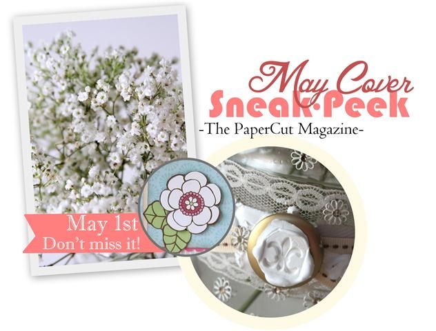
May- The PaperCut Magazine

Our last issue got so much love that we
can't wait to show you the newest issue of 
The PaperCut Magazine. Don't miss it the first week of May!
It's packed with new craft ideas that will inspire you this spring.
I mean... just check out this cover sneak peek!
Photobucket
So soft and Pretty right?! 
Again... Don't miss it, because it's a great issue that we are so proud of.
~H

4.23.2012

3 pretty layouts

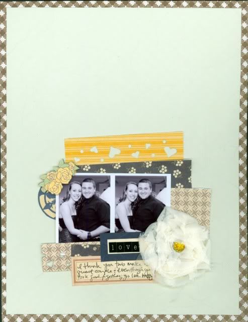
Hello ladies, Nicole here. I just want to take a few minutes to thank Heidi for having me on the G.C.D Studios DT this past year. Being on the team was fun and I learned a great deal from her. Congrats to the new team and I look forward to seeing your creations! I must admit, I am a little sad but I'll still be playing with my G.C.D Studios papers and to prove it, I have a few layouts to share with you using the new collections. I love the "Happy Days" collection! At first, I thought it was too girly for me, but after I really looked past all the pink, I noticed the adorable patterns! I love that I could save a few dollars by cutting patterns from paper to create my own embellies!
 
Supplies: Patterned paper:G.C.D Studios Thickers: American Crafts Pearl: Zva Creative Corner rounder: Creative Memories Here's a layout using lots of Splendor papers by G.C.D Studios. I saw this photo on Pinterest and was immediately inspired to scrap with yellow, white, blue, and brown.

Photobucket

I totally love this layout! Isn't it pretty? I like how it is pretty but yet masculine. This is a picture of my beautiful sister, Jamie with her amazing boyfriend. She's very lucky to have such a great guy!


Photobucket

 Supplies used: Splendor patterned papers: G.C.D Studios Brad: G.C.D Studios Labels: G.C.D Studios Flower: Maya Road Embossed cardstock: Creative Memories Teeny alphas: Glitz Design Heart punch: Creative Memories Pen/Adhesives: Creative Memories And Here's a quick layout that I created using lots of papers from the Bonjour collection! I just love the turquoise and browns! These papers are perfect for those of us who have boys. I love that the patterns in some of the papers are big enough that you can cut to make your very own embellishments! You can see how I did this with the patterns on my layout. Super easy! Thanks for stopping by today and I hope you have a great day! Supplies used: Bonjour patterned papers: G.C.D Studios Button: Epiphany Crafts Button tool: Epiphany Crafts Bling: Creative Memories Baker's Twine: Scrap Pantry (Esty) Thickers: American Crafts Pen: Adhesives: Creative Memories

4.22.2012

Adding dimension though layers and other fun,easy tricks

Hello! Its Windy here with my final post for GCD's blog. Today I'm going to share a few tips for making simple, but beautiful cards. 

Labels and Tags, Heirloom and Navy Flora patterned paper from Splendor Collection

A quick and easy way to add interest to a project is by adding dimension though layers. On this card I've created four different layers and adhered them to the card base with foam tape. 
I also applied ink on each edge layer for added interest. A few crystals and twine and this simple card can be completed in 10-15 minutes. 

Here's another example... 
Sweet Tart and Cherry Cordial patterned paper from Sweet Tooth Collection

Simply fussy cut a few of the designs from your left over the pattern of the paper and add right over top of the design with foam adhesive.

Add embellishments and your are finished. 

Take care!

Photobucket

4.21.2012

sentiment/patterned paper

Well, it's time for me to say, "goodbye" to my year with GCD Studios. I had a hard time coming up with just one final project, so I've actually made two! We'll start with this little ditty...


I made the whole card, but once it was done I realized I forgot to add a sentiment. Eek! So, I took some old rub-ons and turned the patterned paper into sentiment/patterned paper. I think it turned out pretty cute. I love a bright and happy card. 

This next card could be easily replicated with every patterned paper released this season and virtually any sentiment. It's a great sketch staple to keep on hand for easy to whip-up cards.

I had so much fun working with these fun papers. I bet you will too! 
Bye for now...
Supply List:

4.20.2012

Too cute to be eaten!

Hi! Agus here! For my last assigment I have to use something from my home, when I read this I immediatly thought of pasta! I had this idea for a while but never got the opportunity to do it, until now! Letter pasta and Farfalle (bow pasta) are both, my favorite pasta, I think they are so cute!


For the first card I painted both the letters and bow with acrylic paint and I matched it with Pink Flora of the Splendor Collection. For the second card I wanted to go one step further and add glitter instead of acrylic! For the background I used Letter Tiles and Posies (also from Splendor, I love that collection!)


So next time...think twice while eating pasta and you might find something crafty to make!

4.19.2012

Get out those photos

I instantly fell in love with the Splendor line by Heather Tozzi. It's as though Heather designs with me in mind. Hee! Remember The Great Outdoors collection from last year? The one I'm pretty sure I used for every one of my assignments? Yay, that was Heather's too! Thanks Heather for ROCKIN so much! So many times when creating a layout I tend to stick to a single photo. However, every once in awhile it is fun to use multiple photos from one event. With that being said, I would rarely use an EVEN number of photos! I have a weird thing with having to have things balanced & that means an ODD number of elements. I know, I know, but it just makes sense in my own mind. With that being said, I used FOUR photos on this layout. But, because the two horizontal photos flow together, it works. Is anyone else obsessed with little things like that?

 Photobucket

Photobucket

Photobucket

 This is also my last month with GCD Studios. I have been so incredibly blessed to have been here for two years. It has been a wonderful team to be a part of and I have learned so much! Thank you Heidi & the GCD team for letting me hang out with you these past two years!
  Photobucket

4.18.2012

This pretty flower

I love Spring! Seeing flowers blossom lifts my spirits and helps to shake off those winter blues. I recently photographed these pretty flowers in my neighborhood:
A page about flowers deserves a special flower embellishment, so I made a unique blossom out of pennant shapes.
To recreate one of your own, you need a paper punch like this. You could also hand cut your own pennant shapes. In addition, you will need a cardstock circle for the base and glue. Begin by punching out about 20 pennants.
1. Add a ring of glue around the edge of your circle. 2. Begin sticking the pennants to the circle, overlapping just a touch. 3. Add another ring of glue to the center of the circle and begin layering more pennants in a second row.
When finished, add a button, brad, or rhinestone. For an added something special, cut leaves to match. I made the leaves on my layout from denim, but felt or patterned paper would work well, too.
For more dimension, you can curl the tips of the pennants before gluing them down. For more variety, you could use multiple patterned papers for your pennants. However you go about it, the result is a fun, unique flower! Enjoy your Spring - get out, take some photos of the blooming flowers and scrap!

4.17.2012

Use Your stash-Paper Piecing

Sunbursts are so trendy right now! Today I'm going to show you how to get that effect by using your patterned paper to piece one. For this layout I've used the new Splendor collection.
It takes a bit of time, but I really think the end result is SO worth it!
After you've got your photo placed, you can embellish your 'rays' of paper with stamps or buttons.
Thanks for stopping by today! I hope you'll try out this technique soon ;) Photobucket

4.16.2012

Stop and smell the roses

I've been feeling nostalgic as of late. Today's post is another something from my past. My great-grandmother whom we called "Mom" loved roses. I never really did like them myself. That was of course until we moved on base here in Washington with a home that had not one, but three roses buses. They were very beautiful and hearty too. I loved taking care of those roses and realized how much they reminded me of Mom and how she tended and cared for her beloved roses.


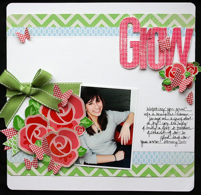
So you can believe when my next assignment came down from GCD Studios that I knew what I was going to do!  This time I played with the cute Oh Happy Day Collection. I love the roses in this collection! So when I started fussy-cutting those beautiful hearts out. All in mind of how much Mom loved and tended to those roses all those years and how much we need to grow. Born was this layout from those memories, ah wonderful memories!!!

Elizabeth Carney 2012 GCD Studios DT, Elizabeth Carney 2012 GCD Studios Layout Gal