8.31.2012

Summer Week: L.L. Bean Canvas Totes

It's Amanda!  School may be in full swing for some of you, but summer is hardly over!   Like many women, I have an ever-growing collection of purses and totes.  When summer rolls around, I just can't resist the iconic L.L. Bean canvas totes.  I wish I had one in all sizes and in all colors.  So, rather than draining my bank account, I made a mini tote reminiscent of an L.L. Bean tote.  This little ditty would be perfect for a summer gift!


Cute, right?   It may look big in the picture, but the bag (not including the handles) is just 3.5" tall.  It's so wee!  It is just the perfect size to fill with candy or other fun goodies.  

Here is how I made the tiny tote (inspired by THIS tutorial).  Lucky for you, I have already worked out the kinks.  :)

1. Start by making a small box from a 3.25"x4.5" piece of paper.  Score at 1/2" all the way around, trim tabs and adhere.  

2. Cut a 3.5"x12"strip of paper.  Add two stitches across the top of the paper.  Make 3/4" long scores at 1 3/8", 5", 7 1/4", and 10 7/8" at the bottom of the paper.  You don't want to score all the way up if you want your bag to look round. 


3. Cut two 1/2"x12" strips of paper for the handles and one 3/4"x 12" strip of paper for the bottom.  Stitch handles and then stitch the bottom piece. 


4.  Using the scores as a guide, adhere bag top to box using strong adhesive (I used Scrapbook Adhesives Crafty Power Tape).  


5. Add a decorative flower and you're done! 

Enjoy the remainder of your summer!

Supplies
From the Flower Child Collection: Wondering Geo 1683, Groovy 1642, Flower Child Plaid 1639, Swirling 1648.  Pearl brad (American Crafts), thread (Coats & Clark)

8.30.2012

Summer Week: Beach Cards

Here's the code for my cards on August 19th. I didn't know if I needed to cc to Heather, but I did so anyways! :-)      Hey there friends! This month the GCD blog is focusing on all things summer. From waves and splashes to palm trees and souvenirs, were going to show you how to incorporate two of  fun lines in your paper-crafted projects! Today I am going to show you two cards that celebrate one of the most-traveled to summer locations; the beach!
 I try not to go for the most obvious ideas, so I stayed away from sun, surf, beach balls and beach castles. I had this adorable little bathing suit cut file, so I die cut the suits using paper from the Oh Happy Day collection and strung them on some baker's twine! 
I love dimension and popped some of the suits up with foam tape! This card would be perfect to give to a girlfriend ready to sport her new suit at the beach! The next card
 is a little bit more my girlfriends and I! 
Okay, I don't have kids and I hate getting sandy, so my idea of beach fun is sipping a tropical drink while soaking in the sun! I die cut some umbrella drinks using patterned paper from the Flower Child collection. I love love love this collection, especially it's bright colors and geometric prints!
Too add a little dimension, I added some funky ribbon and popped the umbrellas up with some foam tape!
Well, that's it for me today! Check the blog for more amazing ideas and projects all month long!


Supplies: "Lovely Suit" Card: Oh Happy Day collection: Mira's Pearls (1764), Alicia (1765), Chloe (1766), Hailey (1767), Priscila (1768), Amber's Ave (1774). Other Supplies: Sentiment (Studio Calico). Dye Ink (Tsukineko). Pearl stick pin (Maya Road). Star punch (Epiphany 
Crafts). Baker's twine (Creative Impressions).
"Happy Hour" Card: Flower Child collection: Wondering Geo(1638), Flowery (1641), Groovy (1642), Hippie Plaid (1643), Layered Geo (1644), Peacock (1646), Striking Stripe (1647), Twisted Floral (1639). Other Supplies: Sentiment (Paper Smooches). Dye Ink (Tsukineko). Pearl and crystal (Queen & Co). Orange twill. Turquoise dot (Bo Bunny).


8.29.2012

Summer Week: Scrap Those Photos

We have been having an extra busy summer this year, traveling to a lot of lakes and cottages, and seeing lots of family and friends.  I know, sounds just awful, right?  :)

My daughter is becoming more and more fearless of the water, which is good and bad at the same time. I had my brother snaps these photos of her on my "action/sports" setting as she was jumping off the dock into the water.


I wanted to mimic the setting on my page, so I created some "waves" with the navy strips that I tore along the top edge to give it a white edge.  I like the yellow accents, so I did a few tiny punched waves and then machine stitched a wavy line with navy thread.


The clouds matched the background paper perfectly in color, and I love how the different pattern on them makes them stand out just enough from the background.  The sun I created with a sun-shaped punch, and then punched it out again with a larger circle punch.  I then backed it with yellow patterned paper using pop dots.

Summer is starting to wind down and before you know it, Labor Day weekend will be here!!  Hope your last few days are filled with lots of sunshine and good times!

Supplies:
Papers by GCD Studios-
Flower Child "Hippie Plaid" #1643
Flower Child "Flowery" #1641
Flower Child "Wandering Geo" #1638
Flower Child "Layered Geo" #1644
Flower Child "Twisted Floral" #1649
Oh Happy Day "Chloe" #1766
Oh Happy Day "Amber's Avenue" #1774
Other-Mists-Studio Calico and Tattered Angels


Audrey Yeager GCD Studios DT, 2012 GCD Studios Layout Gal

8.28.2012

Summer Week: Bright and Happy layouts

I really like creating happy/bright colored layouts. I also love photography, so mixing the two is even better. Today I am sharing a page and sketch featuring some adorable birds that I took at the zoo. The local zoo has a great bird exhibit and I was able to get natural photos of birds from all over the world. I especially like taking photos of brightly colored birds as you will see below. I used my telephoto lens with my Canon Rebel to take these snapshots. My layout consists of four photos: three photos of birds and one photo of my son, the bird watcher. The page features all of the main photos together and the last photo by itself to give emphasis to it (my son's expression is priceless). I also designed the colors of the page so the bird photos would pop over the yellow background. Going along with the "bright" theme I used a sun accent and a couple of clouds to give it that outdoor look.  All of my papers are from the GCD Flower Child Collection. Take a peek at my page!
Here is a sketch of my page. Feel free to flip it, alter it, whatever you like to suit your page!


Hope you have fun with the sketch!!


8.27.2012

Summer Week: Sandy Days

It's HOT outside!  No better place to hit than the beach!  For as long as I can remember, the moment my son hits the beach he dives into the sand to begin building a castle.  In this layout, I included some sand to help capture his ‘true love’ for the beach. 


I had fun embellishing this layout with lots of different things.  To begin with I used several pieces of pattern paper to create the banner. 


I decided to add the sand under the title so I used a Spellbinders die to cut out a wave. 


I ripped some a soowang tape sheet and folded it half back and placed the wave over half the sticky area.


Next I dumped the sand that I had collected over the sticky part and pressed it down.  You can buy scrapbooking sand or you can be sentimental and use the real thing! Next I pulled out the rest of the backing of the tape, added some pattern paper and trimmed it down to fit on my layout. 


I also used Spellbinders Nautical shapes too accent my page.  Using them as a stencil, I left the paper in the die and adding some liquid adhesive and then poured on more sand.


I was excited to find this trim in my stash of stuff.  It already had shells hanging off of it.  The perfect touch!

Supplies:  Organic Geo (1645) – Flower Child, Twisted Floral (1649) – Flower Child, Groovy (1642) – Flower Child, Swirling (1648) – Flower Child, Peacock (1646) – Flower Child, Layered Geo #1644, Bouquet (1535) – Bonjour
Other:  Cardstock, Stickers, Trim, Ink, Spellbinders Die Templates


Julie Overby GCD Studios DT, 2012 GCD Studios Layout Gal 

8.26.2012

Summer Week: We All Scream for Ice Cream

Hi there!

Today's theme is ice cream, but thought I'd think a little outside the cone...

 with an Ice cream truck card!

Nothin' says summer like an ice cream truck riiiight? I didn't grow up where there were ice cream trucks, but when my brother and I would go visit my grandparent they would come by a few times a week during the summer and we would get soooo excited! Somehow ice cream from the truck tasted better than anything you could get at the store. (yes, I know they're probably the exact same bars that mom picked up, but from the truck it was special ;)

Supplies: (Cardstock: (white) Georgia-Pacific, (gray) The Paper Co., Patterned Paper: (Myra's Pearls, Alicia, Haylie, Amber's Avenue from the Oh Happy Day Collection) GCD Studios, Stamps: (Sentiment Sampler) Paper Smooches, Ink: (Tuxedo Black) Memento, Marker: Copic, Die: (Classic Triple Scallop Edgeabilities) Spellbinders Paper Arts, Buttons from stash
Size: 5.5"x5"

My truck was created entirely with the "Oh Happy Day" collection. The bright, sherbet-y colors were just too perfect not to use. I created my own pattern to make the truck. the only thing I added beyond the pattern was the little awning, It was created by using a border die along the edge of a strip of cardstock then scoring it and adhering the edge behind the window frame. Oh, and I added the strip too.

Just in case you like my little ice cream truck card enough to want to make one for yourself, I've provided the pattern for you to use. Just click to make it larger and right click to save the file.


What makes you think of summer?

8.25.2012

Number Week: Larger And In Charge

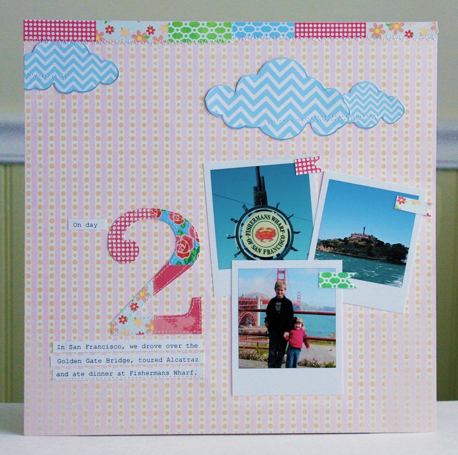
It's numbers week here on the GCD Studios blog, and today I have a layout to share that focuses not only on the photos, but a number too! This was day 2 on our trip to San Francisco, and I picked a few of our favorite activities from that day to highlight.


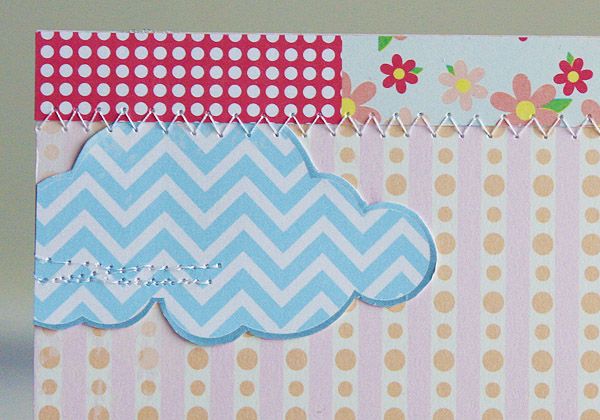
I did a bit of fussy cutting for the clouds, then added a little machine stitching for just a bit of texture.


Thanks for visiting the GCD Studios blog where we love to inspire!

Supplies Used:
papers: (1763) Emily Rose, (1764) Mira's Pearls, (1766) Chloe


8.24.2012

Number Week: Journaling

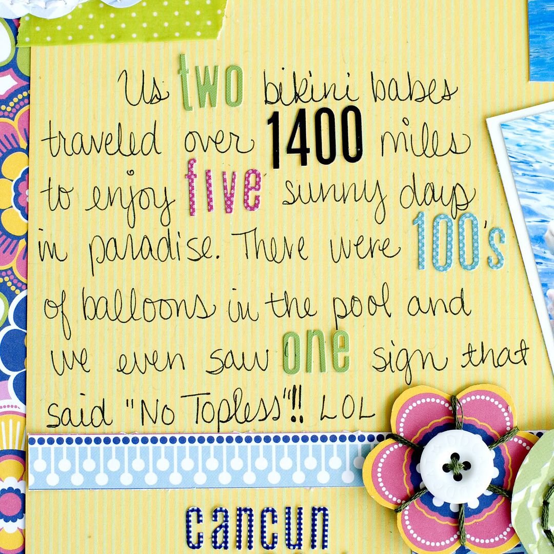
Good morning everyone!  It's Tegan again and I want to share a very summery layout with you.  My sister and I visited Mexico last year and the resort had a sign at the pool that said "No Topless"!!!   If you think I am joking take a look at my layout~  I had taken a pic of the sign, so I used it as the title.  I was just in awe I guess, because the thought of going topless in public would NEVER cross my mind.  Oh well, at least the sign was cute!

     On this layout, I also wanted to add numbers to my journaling for an interesting look!  I love it!!!


And a close up of the journaling

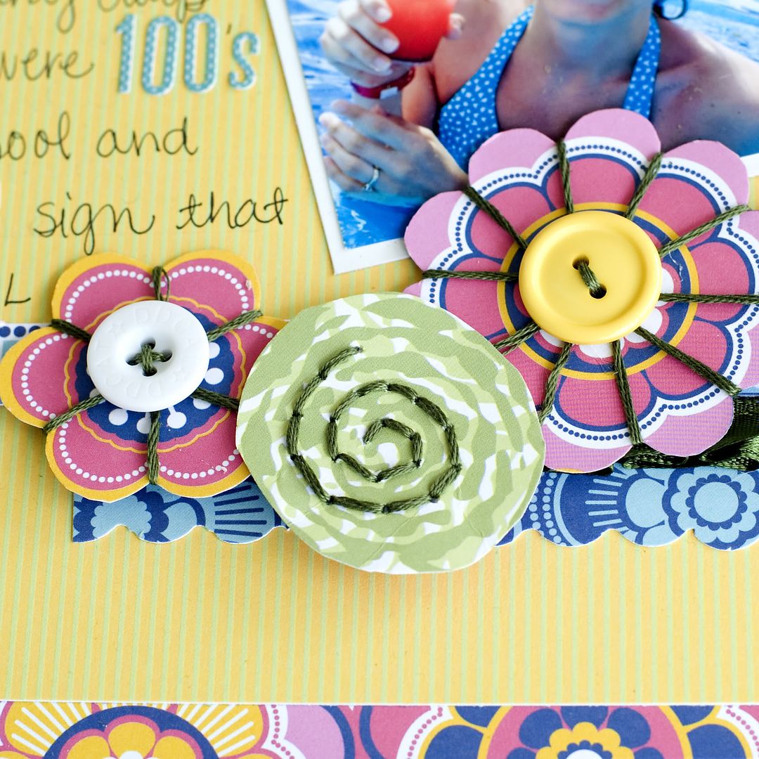
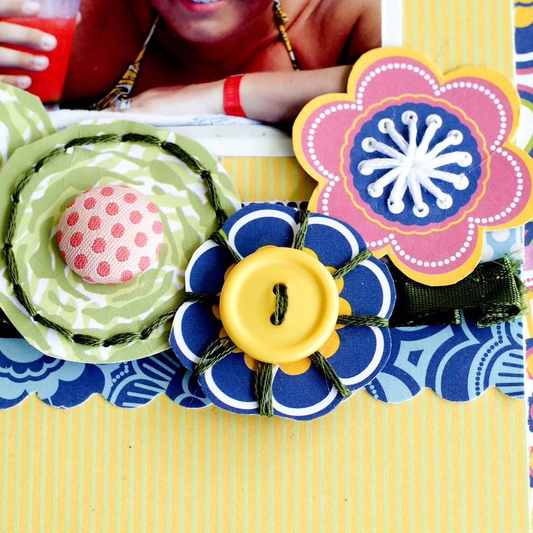
I also want to show you how I made my own embellies using the Flower Child papers....


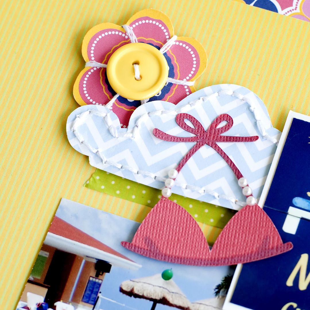
This flower is made using Flower Child and the uber adorable cloud is part of the Oh Happy Day collection!  Using embroidery floss is my new favorite technique right now! It is super fun~ you should give it a try!  


I hope I have inspired you. Have a great day!
If you would like, you can visit my blog here

Tegan Skwiat GCD Studios DT, 2012 GCD Studios Layout Gal

Supplies:
GCD Studios Flower Child collection: Flower Child 1640, Swirling 1648, Flowery 1641, Peacock 1646, Striking Stripe 1647, GCD Studios Oh Happy Day collection: Chloe 1766, alphabet stickers (Lily Bee), washi tape (Bella Blvd), embroidery floss (DMC), ribbon (Maya Road), brad (Crate Paper), pearl gems (The Paper Studio), buttons (my supply)

8.23.2012

Numbers Week: In Your Title

Hi there, it's Clare again with another layout! Shocker, I know. ;)
For this layout, I wanted to document my flight over to Europe, which took place this past May on the 17th. Accordingly, I die cut some numbers to show that on my layout...


This cloud paper from Oh Happy Day fits the flying theme perfectly! 


I used my flight ticket stubs to make little tabs to pull out some journaling cards from underneath the photos (edges mounted with dimensional adhesive to make this possible).


The Thickers you see here were originally a strange white that didn't fit with the layout, so I colored them over with a big ol' black sharpie - an easy way to get a different color on your stickers! Also, you can partly see in the photo my baggage tag, which I figured I may as well stick on. ;)

Well, I hope I didn't press my luck (and your patience!) with posting a second layout! ;) Thanks so much for stopping in with me today! :)


Blog: http://bearydocardsinc.blogspot.com/

******************************************
Supplies:
Oh Happy Day - Chloe, Andrea, Hailey
Flower Child - Layered Geo, Groovy 

8.22.2012

Numbers Week: texture & numbers

Hi there! Today I'm going to show you how to add a little texture to your page...along with some numbers. When I chose this assignment I knew exactly what I wanted to do -- scrap about my nephew's birthday party last month.

Since the boys were turning 1 and 4, I went ahead and cut these numbers out with my Silhouette using paper from the Bonjour collection.

I used a Cuttlebug embossing folder to add texture.

Since I thought they needed a little contrast to stand out, I adhered them to blue cardstock and trimmed the edges.

Also using papers from the Flower Child collection, I die cut and punched stars to embellish the bottom of the page.

To finish off the layout, I used some machine stitching and added a banner to the top of the page. I hope you'll try this technique out sometime! It would be great with letters and titles too.

Jennifer Chapin 2012 GCD Studios DT, Jennifer Chapin 2012 GCD Studios Layout Gal