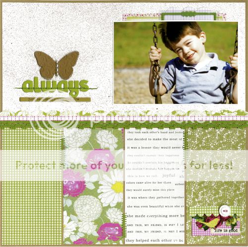
Immediately I was drawn to the feeling of spring portrayed by these photos. I had a picture of my son on a swing with this gorgeous green grassy background that I new would be perfect for this challenge. Now, a color theme involving pink may steer some away from showcasing a boy pic - but have no fear!!!! Pink elements can totally work on a boy layout - I promise :) Check out what I came up with . . .
I used a combination of papers from the Homespun Chic Collection & the Artsy Urban Collection. I LOVE that I was able to find patterned papers within both collections that coordinated so nicely :) I did a bit of machine stitching to tie each patterned paper to the next. I also added another small "pop" of pink in the bottom right-hand corner using a portion of one of the fabulous Homespun Chic inspiration cards, topped with a section of one of the Homespun Chic die-cut borders. I finished this off with one of the adorable Homespun Chic buttons - love the uniqueness of these!!!
For the title work, I knew I just had to incorporate one of the word strips from the Homespun Chic Collection. I love finding products like these that put into words just what we all want to say :) Above the title is one of the GCD Studios chipboard butterflies. I used the Chip Art tool to deboss some flourish images into the shape & then painted it a kraft brown color. To distress it a bit, I sanded the edges & finished it off with a few pearl accents in the center :)
I am all about layering recently, especially embellishments. The Homespun Chic Collection offers numerous choices & I LOVED the look of their recipe card, transparency, and inspiration card all together. A fun little touch peeking out from the top of the photo :)
I encourage you all to use this theme of pinks, greens, and creams on your own spring layouts & if you are feeling a bit adventurous . . . try mixing in those boy pics!!! You'll be surprised at how nicely a "pop" of pink can add just the right touch to those layouts of the boys (& men) in your lives :) Have a fabulous Thursday!!!
Julie


Beautiful work Julie!
ReplyDeletehugs
Laura
Lovely layout Julie!
ReplyDeleteGorgeous layout! Love it! :)
ReplyDeleteWOW!! Oh sooooooooooo lovely!! Absolute perfection!
ReplyDeleteSooo fabulous!!! REALLY!!
ReplyDeleteSo, so, so pretty!
ReplyDeleteThis is stunning Julie! LOVE that photo!
ReplyDeleteAbsolutely beautiful Julie! I never would have though to use pink on a boy LO, but it totally works!
ReplyDeleteHi Julie,
ReplyDeleteA very lovely layout and I've never seen anything wrong with using pink in a layout with a boy. Super job!
Hugs,
Meri
I love your l/o Julie! It all flows so elegantly together! Beautiful work!
ReplyDeleteThis is a gorgeous page!! Love it!
ReplyDeleteThis is fabulous!!! Love the mix of papers and that butterfly is perfection!
ReplyDeleteAmazing layout - just love the combination of colours and papers - beautiful! I use pink on layouts with my son all the time - so I agree with you on that completely
ReplyDeletewhat a fab boy layout! terrific Julie!
ReplyDeleteBeautiful!
ReplyDeleteLove the texture on the butterfly !!
ReplyDeletethis is so gorgeous, Julie!
ReplyDeletegreat mix of papers and love the pink on a boy layout!!
ReplyDeleteLove what you did with this! Love the color blocking and the little touches you added!
ReplyDelete