 I see blues, reds, bricks, circles, and a 2 page layout featuring a girl back to school shopping. Say what??Yes that is what came to mind when I first saw the photo and the end of summer theme. I knew i wanted to do something with that stack of receipts that I kept from our back to school shopping trips last year and use journaling how crazy shopping with a teen girl can be.
The brainstorming began.. and this is the 2 Page layout I created.
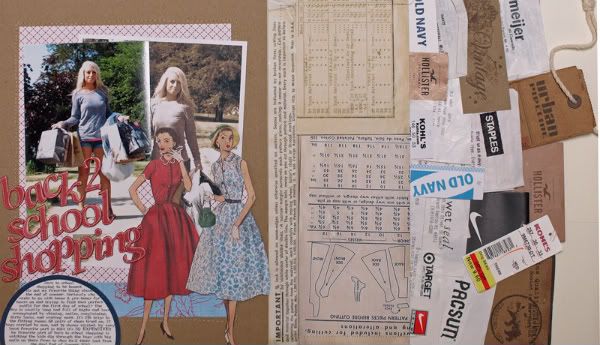
You can see in this photo that the layering of the receipts mimics the brick pattern and colors a bit. Believe it or not this isn't all the receipts from last year, yes there are more! Crazy I know.
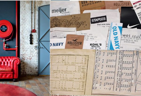
Next this photo shows the half circle that I used for my journaling, the colors , and patterns that inspired me to use the GCD Studios papers on this layout. When I was flipping through my alphas trying to decide which one to use this red Alphabet jumped out at me right away it reminds me of the couch. What do you think?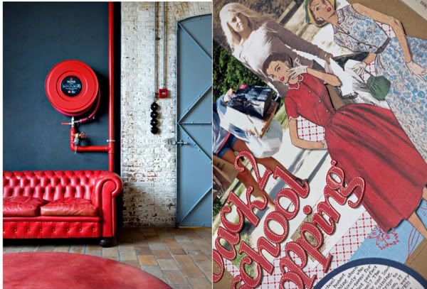

And those ladies from Melody Ross' Vintage Jane pattern paper well they just had to be used on this layout they so look like they were out shopping on the town just like Jessie.
Vintage Jane - Homespun Chic by Melody Ross
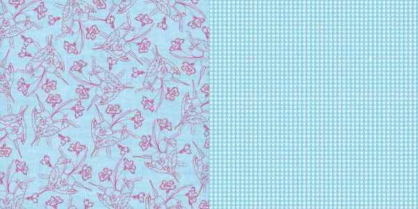
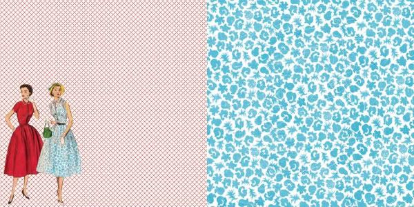 Vintage Audrey - Homespun Chic by Melody Ross
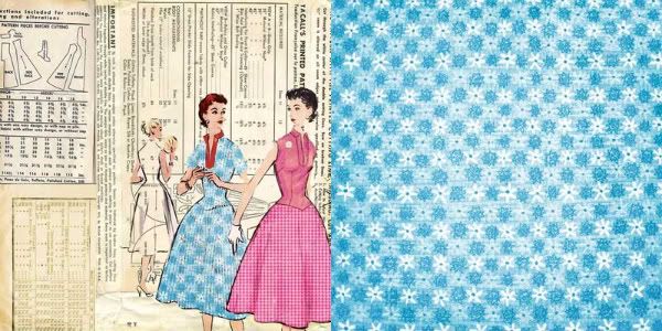 Blue Redwork - Homespun Chic by Melody Ross
So now that you know how this photo inspired me what so you think? Do you see what I did? Something else? If you are inspired to create something do share! Thanks for stopping by!
GCD Studios Products Used: Vintage Jane - Homespun Chic by Melody Ross
 Vintage Audrey - Homespun Chic by Melody Ross
 Blue Redwork - Homespun Chic by Melody Ross


This is AWESOME! I loveeeeeeeeeee how you added in the receipts and the tags! Very COOL! :):):):):):):):):):):):)
ReplyDeleteLOVE this! Now I know what to do with my papers! :-D
ReplyDeleteCool idea!! Love it!
ReplyDeleteSo fun! Love the collage of receipts and tags! And I LOVE those alphabet letters!
ReplyDelete