5.31.2012

Circle Week: Scallops

Want to know my most favorite thing about GCD Studios? The paper! I love that each collection is designed so beautifully, that I have a hard time choosing which side of the paper to use! Splendor is a perfect example, and for my layout I really did have a hard time choosing which side of the paper I should have facing up! I love Splendor too for it's timeless look. The photo I used is of my Mom and I on her first Mother's Day way back in 1964. It looks great with the papers, but I could have just as easily used photos from 2012 that would look perfect too.

To create this fun scallop look, I punched small scalloped circles, and glued them to the back of a larger circle. I did a little machine stitching to add a bit of dimension.

I added the "a sweet life" ribbon since I thought my Mom deserved a ribbon to honor her on her special day. I layered a few of the tags from the labels and tags paper and cut two pennant shapes to the ends to really make it look like a ribbon.
Thanks for stopping by today, I'm happy I could share my first official post as a GCD Studios Design Team Member!
Supplies Used: patterned paper - GCD Studios Splendor line (1676) Candytuft, (1679) Labels & Tags, (1680) Letter Tiles, (1682) Pink Flora, (1683) Posies, (1684) Sunswept, (1685) Tiny Blossoms, (1687) Zig Zag, Twine - The Twinery
Mary Ann Jenkins GCD Studios DT, 2012 GCD Studios Layout Gal

5.30.2012

Circle Week: Journaling With A Template

Hi there everyone!   It's Tegan here again.  I can't believe it's almost June but that means strawberry picking season is about here in Indiana.  Yippee!  Can I give you a little friendly advice from someone who goes every year? Number 1 is take your camera and number 2 is never, I mean NEVER wear a white shirt.  It doesn't matter how hard you try to keep it clean, strawberry juice will somehow get on it~ I unfortunately speak from experience!  (Notice in my layout that I only wear bright pink for U-Pick anymore!)   And I also have to confess that I sometimes don't include as much journaling on my layouts as I probably should.  So I was up for a challenge involving journaling AND circles!  This helped me get my creativity going...


And now journaling is my friend!


                                                       Isn't this berry just so YUMMY!


                                Don't you just love these little strawberries AND the birdies!?
                                         

                                   Well friends I hope I have inspired you somewhat today~
and not just made you somewhat hungry for strawberries!


Supplies: (all papers)  Sweet Tooth, Sweet Tart (1562) - Sweet Tooth, Peppermint Plaid (1558) -
Country Charm, Sweet Floral (1512) - Country Charm, Strawberry Jam (1510) -
Bonjour, Bouquet (1535) - Bonjour, Bonjour (1534) - Oh Happy Day, Abbie's Sunshine (1769) -


                               Tegan Skwiat GCD Studios DT, 2012 GCD Studios Layout Gal

5.29.2012

Circle Week - Cool Patterns

                     Hey friends! It's Circle Week at GCD and I'm excited to share two fun approaches to incorporating pattern in new ways; drawing attention to this sometimes overlooked, but very versatile shape.       Pattern, simply defined is the repetition of a design element. It's easy to be tempted to punch a lot of circles or scallops and then layer them onto a card to create a simple pattern. However, I like to challenge myself, so I needed to think of an approach that hadn't been done yet. To accomplish this, I like taking an idea and then twisting it to fit my style, as well as to inspire others, which is what I did for today's first card.      To jumpstart my creative juices I wandered over to Pinterest to find some inspiration. I totally flipped when I found this image. I loved the layering of the circles, as well as the posititve and negative space the circles create where they overlap. Although, the design is pretty asymmetrical, the repetition of circles and colors create a dynamic, retro feel and an interesting pattern .
Happy Birthday Card
Pattern does not need to be just simple repetition of something over and over. I used shape and the color (blue) to create an asymmetrically balanced pattern of circles.
This card was a cinch! All you need is a circle punch and a template to make the "x-shape." I wanted to focus on the circles overlapping and how they created new shapes that were still rounded and circular.
Circles are a great shape. They can stand alone boldly, but also create a fun intersection of lines when you overlap the shape. I love the chic and retro feel of this card and  GCD's Flower Child was the perfect collection for this design! Bold blues, bright pinks, cheery chartreuse and yellow--such perfection!
Hi Card
Using a template to create a design of repeating patterned paper is another fun take on circles.
For this card all you need to do is trace the template onto paper from  GCD's Oh Happy Day line! I chose Andrea because it was a great neutral background. After trimming the spaces, I added pieces of Emily Rose paper which a collage of all the fun patterns in the Oh Happy Day collection, but smaller scale. I like the idea of a color spectrum and the smaller scale patterns look super festive in the trimmed spaces of the template.
Well, that's it for me today.
Make sure to check the blog tomorrow for more fun ways to use circles.


5.28.2012

Circle Week - Crop...Crop...Chop!

Hey there Elizabeth here! I wanted to show you an easy way to create circles on your pages!
We all like shapes don't we and this month GCD Studios is rockin' the circle shapes. I especially love creating circles myself and try to use them as much as I possibly can.
Here's what I created:


Supplies: Flower Child Twisted Floral papers, Sweet Tooth #1558 Peppermint Plaid papers, American Crafts cardstock, CM corner rounder, American Crafts Thickers, Doodlebug Pearls, Computer font Century Gothic.


For this layout, I went back to the basics. I used my Coluzzle Circle Template along with my Marvy circle punches. I used both the cutter and punches and just cut straight into the cardstock wherever I wanted a circle. I didn't have any kind of pattern going, I just cut and punched! This way a design was formed and I wasn't even trying! I also punched out circles and added those to the page later. When the cardstock was cut, I took another sheet of pattern paper from GCD Flower Child and added that to the backside of the cardstock. I just adhered the two together then added all of the other circles I created. Once those were adhered, I cut my photo with my Coluzzle as well and placed on the page. I also did this for the journaling too. The effect of each circle is amazing! Some look popped up, and others look as if they are inlet to the paper. I thought this created a neat effect for my page!
Don't be afraid to use anything you have on hand for creating shapes and go for it! Elizabeth Carney 2012 GCD Studios DT, Elizabeth Carney 
2012 GCD Studios Layout Gal


5.27.2012

Circle Week - It's a Confetti Kind of World!

Teri here today, and I'm excited to kick off Circle week here on the GCD Studios blog! Today, I'm talking about itty bitty circles of color, specifically ones in confetti form! Confetti is so fun, so trendy right now and such a nifty way to use your patterned papers. Take a look at Pinterest and you'll find all kinds of pictures with confetti on them. It's so easy to make. All you need is a little bit of patterned paper, a couple small circle punches and the desire to punch, punch and punch a whole lot of confetti-sized circles! I punched about 200 (no lie!) small circles to use like confetti on this card.


The majority of those little circles went inside a small clear bag. I adhered the bag to the card and then made a frame from solid paper to frame it!


 The cool thing is the recipient can shake this card, and the confetti will move around. I took a minimalist approach with confetti for this card.


I only punched about 20 small circles for it. I arranged them so they would look like confetti falling down from the top of the card to the bottom.


 I love how even though the confetti circles are small, you still get a taste of a whole bunch of patterned papers on this card.

  Supplies: Tiny Floral Border Paper – Country Charm, Weekend Fun Paper – Country Charm, Picnic Blanket Paper – Country Charm, Sweet Floral Paper – Country Charm, Super Star Paper – Country Charm, Farm Field Stripe Paper – Country Charm, Peppermint Plaid Paper – Sweet Tooth See you again soon!

  Teri Anderson 2012 GCD Studios DT, Teri Anderson 2012 GCD Studios Card Gal

5.26.2012

Water Color Week- The Fashion World and Crafting

Lately, I've been seeing watercolors pop up all over the place, and I am lovin' it! Most notably, it's been making it's way in the fashion world - just look at this beautiful skirt!
I love watercoloring itself, so I decided to bring that love to my papercrafting with some cards inspired by this gorgeous skirt. The main things that spoke to me here were the flowers and the colors. Pink. Navy. Green. Can you which particular paper line this is leading me to? I thought so. ;) Pulling out my Splendor papers, I got busy...
The flowers were created simple by some repeat stamping, cutting, and crinkling - the perfect thing to do while watching tv!
Flowery and colorful, just like the skirt. :) Thanks for stopping in with me!

5.25.2012

Water Color Week- Water Soluble Oil Pastels

I love the look of watercolors and have found that my favorite way to get that look is to use water soluble oil pastels. The pastels are like crayons and they easily create varying levels of color and are very simple to use. Here's the layout I created.

Photobucket

Because they are like crayons it is very easy to just draw on your paper. You can either wet your paper with a brush or dip your crayon into water.  I often then follow this step with a wet brush to soften the design further.
As you can see from the the photo above,  I also discovered you can easily draw inside small shapes like this stencil.
I worked with a wet tip and simple filled in a little bit of every space on the outside of the design.
I used a slightly damp foam stencil dauber to spread the color around.  Doing this I was able to create an ombre effect. Finally, I painted the edges of the layout with the watercolor using the same wet tip and paint brush technique.
Here's another trick.  I almost always work on my non-stick craft matte. It's a great place to puddle some paint.  You could also do this on a plastic paint palette. Here are some close ups and the layout again.
Supplies: Patterned Paper: GCD Studios Country Charm, Paper Ribbon: GCD Studios, Stickers: American Crafts, Journaling Stamps: Studio Calico and Making Memories, Brads: Crate Paper, Punch: Fiskars I hope this inspires you to pull out your water colors. In addition to Oil Pastel Crayons, water color pencils are also another very easy way to dabble in water colors.  Go ahead, get your brushes wet!!
Leslie Davis 2012 GCD Studios DT, Leslie Davis 2012 GCD Studios Layout Gal

5.24.2012

Water Color Week - Fun Letter Masking

I (Penny Smith) love getting my "art on"! Anything to make a mess, I say!  I have been playing with spray inks for some time-enjoying spraying, stenciling, stamping, and splattering my layouts. But paints- I have been itching to play with them more!

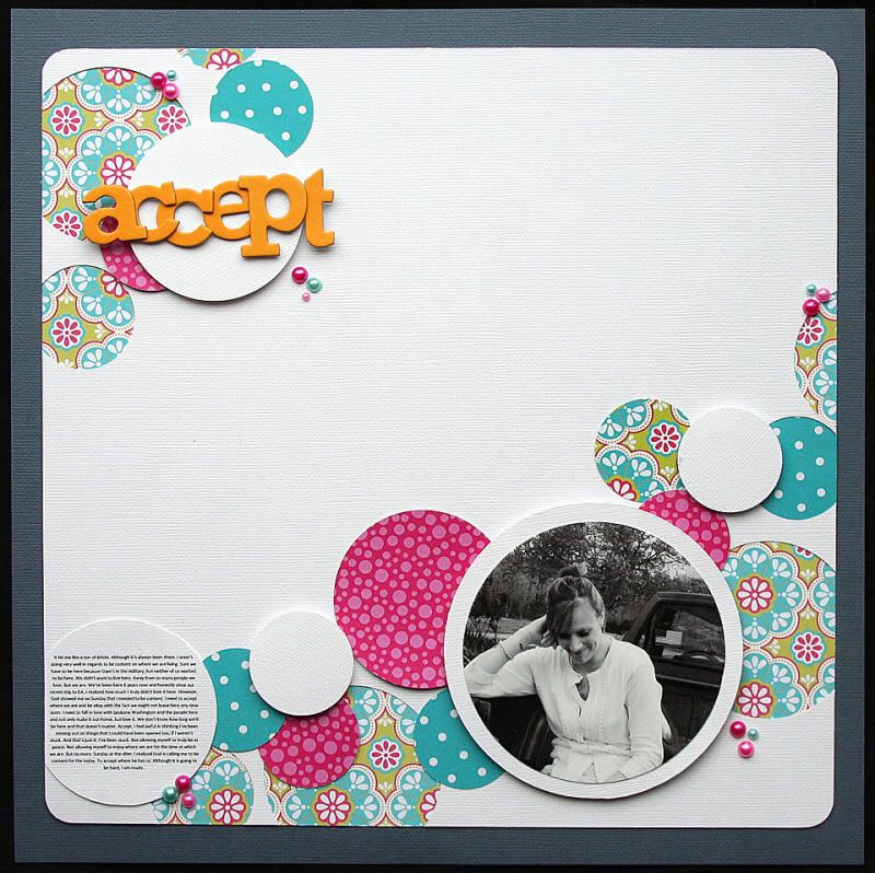
So this assignment, watercolor stenciling, I jumped on!


Photobucket


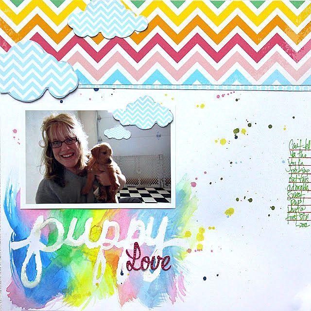
I decided to make my own mask. I just wrote in cursive with pencil "puppy" on card stock and traced around it. Then I erased my initial pencil marks. I'm handy that way. If your a projectionist, you can get your Silhouette or Cricut (probably need your gypsy to do a custom weld) and make one. This is the mask after I used it.
To adhere it to the layout while I painted, I just used repositional adhesive. The repositional Xyron sticker maker would be ideal!
Then just paint around ANY way you would like! Of course this works for spray ink too, but you have more control of where the color goes when using paints. If you don't have watercolors, you can water down acrylics too!
Here is the mask in place. If you get some paint under the mask, you can just touch it with with the background color. But there are NO mistakes! Just artistic opportunity! So don't get too fussy!

The ideas here are ENDLESS! And when paired with Oh Happy Day, you can NOT go wrong!!! :) Chevron clouds. I am in love!

(Supplies: Oh Happy Day: Amber's Avenue (#1774), Chloe (#1766))

Thanks for stopping by! If you make a artsy creative mess, be sure to Facebook it or link us! We would love to see!!!

5.22.2012

Water Color Week: Get Creative With Titles

When it comes to paint, I love working with watercolors. There is something almost magical about the way the water mixes with the color, the way it pools on paper and how the paint blends with other colors. When it comes to scrapbooking, watercolors are my go-to medium for filling in hand-drawn or stamped titles. This layout seemed to call for a watercolor title:


I used Twinkling H2O's (watercolors infused with mica for a glittery sheen) in strawberry colors to create my title. The watercolor effect of the letters reminds me of how juicy those strawberries were - yum!


First, I drew my letters on regular cardstock. You could also print or stamp a fillable alpha. Next, starting with the darkest color and using a fine-tipped brush, I added paint to the bottom portion of my letters.


Then I added a lighter color, blending the colors by overlapping the paint. I made the letters more strawberry-like by topping them with green, then using a milky watercolor to blend the pink through to the green.


When the letters were dry, I cut them out and added them to my layout with just a bit of glue. I like the way the watercolor paint made the letters curl, so I didn't glue them entirely down.


If your next layout is in need of a custom title treatment, give this watercolor technique a try. The end result will be a unique, artsy, and beautiful title.

Supplies used: Strawberry Jam Paper (1510) - Country Charm, Floral Field Paper (1507) - Country Charm, Pink Flora (1682) - Splendor. Other: cardstock, watercolors, pen, mist, fabric tape, washi tape.

5.21.2012

Water Color Week - Spot and Dots

Watercolor dots is my inspiration for today's layout (source for above photo). I decided to get out my mists and get a little artsy!

I started out with a large piece of neutral cardstock. To get the watercolor look, I poured out a little mist then used a paintbrush and a dish of water to paint dots on the background. I used blue and yellow, but by the time I was done more of them were green ;)

I used patterned papers from the Oh Happy Day collection for this layout. 

Thanks for stopping by today! Hope you'll try this fun technique soon.

Jennifer Chapin 2012 GCD Studios DT, Jennifer Chapin 2012 GCD Studios Layout Gal