6.14.2011

Getting crafty with Gina

Hi all! Gina here! I am so excited to share a recent layout that I made for GCD studios. When I first got my Design Team box from GCD studios I was so excited to break it open and try out the chip art pieces and tools. I used them for the very first time on this fun layout with the Homespun Chic collection by Melody Ross.


for this project I used:


To create the stars I used the chip art ornamental frame tool on the chipboard stars.

Then I painted both stars white and then misted one with glimmer mist.

After they dried, I punched a hole through them with a hole punch and then added brads to give them some flair.

Here is a closeup of the star

They make really fun embellishments!


Photobucket


my blog

6.13.2011

Pop it up and make a difference

Our challenge this month was to define our style, which sounds easy. Thing is, I just can't make up my mind what my style is, as one day I feel shabby chic, and one day I feel clean and simple.

I made this card on a clean and simple day...


I would definitely call this my style...on a clean and simple day, that is. ;)

Oh, and I just wanted to share tidbit on how I adhered my big label and those stars...

I had already popped up my background paper with store pop ups, so I didn't want the label to stand out too much more, but I didn't want it to blend in. So I took some thick chipboard (I usually get it from the backing of a paper pad)...


Cut it to size my paper...


...and adhered it one both sides.


Dimension, but not too much. Can you tell which one is backed up by pop dots, and one by the chipboard?


And for the stars? Sometimes I just don't feel safe using my normal roll-on adhesive for little elements, so I use some Glossy Accents (what I like to call a scrappers super glue) to adhere it. :)

Thanks for looking and have an awesome day!

6.12.2011

RV there yet?

Teri here, and I’ve got a couple fun cards to get you in the mood for summer.
Our theme this month was to go bold with patterned paper so I whipped up two road-worthy summer cards with GCD Studios’ The Great Outdoors collection.
This is such a fun collection. Whether you are an outdoors-woman or not, it’s got some fun stuff in it that makes for super fun and witty projects.
Meet the first card.

Here I used a built a card around this “RV There Yet?” sticker.
I thought this saying would work great for a travel card or even an encouragement card.

I embellished the sticker with a Glitter Candy Dot from the Funhouse collection. Other than that, everything on this card is from The Great Outdoors collection.
Meet my second card.

I again used a sticker from The Great Outdoors collection. I again picked a sentiment that made the card worthy of a summer vacation card.

I think this card could also be used as an encouragement card. I think it would be fun to write “Yes, you canoe!” on the inside this card.

terisplace.wordpress.com

6.11.2011

Summer Lovin

Hi there! Jennifer here - this month Heidi challenged us girls at GCD to do a Summer themed layout. Perfect! My little girl loves being outside and going to the pool during the summer months, so I have no shortage of photos. ;)


Another requirement for this assignment was to mix up some patterned papers. I pulled papers from Soul Food and Homespun Chic to create my bright color palette.


I also hand cut one of the banner strips from the Fun House line. Another way to use paper with a subtle or light pattern is to print your journaling on it, then cut into strips as I've done with this page. Did you see the cabochon I snuck onto the page? My absolute favorite embellishment right now for sure!


I also added some machine stitching to my page to add a little texture.


And there you have it! A bright and fun summer layout. Pull out those colors and patterns and get to scrappin'!
Photobucket

6.10.2011

Simplistic with a little bit of shabby chic

First off, let me profess my undying love for the Funhouse collection. It is one of my favorite collections from this season! I used papers from this collection to create my own spin on a "Circus" theme depicting the craziness of my girls' lives.


Supplies: Papers: Funhouse, Soul Food, Letters: Great Outdoors.

Do you ever wonder just what your scrapbooking style is? I often do. If I have to choose what to call my style, I would have to say it lies along the simplistic side with a little bit of shabby chic mixed in for good measure. Most of my layouts usually include a bit of fussy cutting, misting, muted colors, however I did not mist on this layout. Take a moment to look at your layouts, what style would you categorize yourself?


6.09.2011

Artsy titles

Hello! I've been playing with my mists and would like to share a technique for fun and artsy titles.


To create this effect on your own page, grab some alpha stickers that you don't need or care for. I chose an alphabet that I wasn't really in love with and wasn't planning to use any time soon. Lightly put your stickers down on the layout where you want your title to go. Don't press the stickers into your layout too much - they will be hard to remove later without causing damage.


Next, spray your mist lightly over the letters. It's better to do a light spray, let it dry, then spray again if you want a dark misting. When the mist is dry, carefully, slowly, deliberately peel the stickers off of your layout. To add more contrast, take a pen and doodle around the edges of the letters.


Afraid the stickers are really going to stick? Are you wearing jeans? Before adhering your stickers to your layout, press the sticky side into your jeans and quickly pull away. Enough lint will be stuck to the stickers that they won't adhere to your page entirely, making them easy to remove later. I hope you've been inspired to jazz up your titles with this fun technique. Thanks for stopping by and happy misting!

6.08.2011

Reminds me of a slice of watermelon

Hi there!! Valerie here, with a layout that I made using two of GCD Studios gorgeous paper lines!!


Photobucket

I just love the bright colors in the Homespun Chic and Soul Food lines - especially the papers that I used on this layout featuring some photos of my children taken one hot summer day! The colors remind me of a slice of watermelon with the gorgeous pinks and greens with a splash of gorgeous sunlight!! These lines are easily mixed and matched together and make layering lots of different patterned papers so fun and easy!
I used these papers from Homespun Chic:
Petit Blossoms Vintage Birdie Glitter
Pink Sparkle Glitter
And these paper from Soul Food:

Lovely Green Funky Soul

Have fun creating!!


6.07.2011

What would you say your style is?

Every time I see the question what's your style? I get that" oh no... I have no idea what my style is", because I'm a fly by the seat of your pants kinda gal when I create. I go with the flow and what ever happens to work. I always focus on my photos and add paper & bits that fit, so today I'm going to say I'm a "Modern Paper Piecing Mix". No there is no definition for that in the dictionary and google probably can't find it out there on the web either. So, here you have it.... a Modern Paper Piecing Mix layout:
Clusters... oh I love my little clusters.the title is heat embossed and outlined.Love love love the Fun House Ribbon Spool!

What would you say your style is?

Photobucket

6.06.2011

Summer in the heart

In an effort to "think summer", I combined these papers from the Homespun Chic collection:


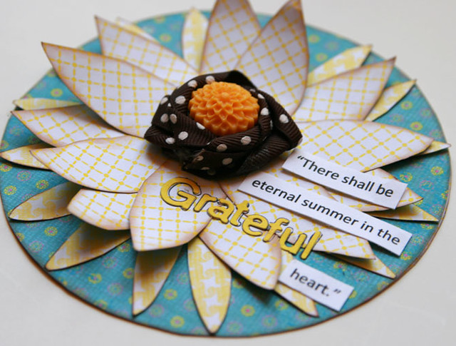
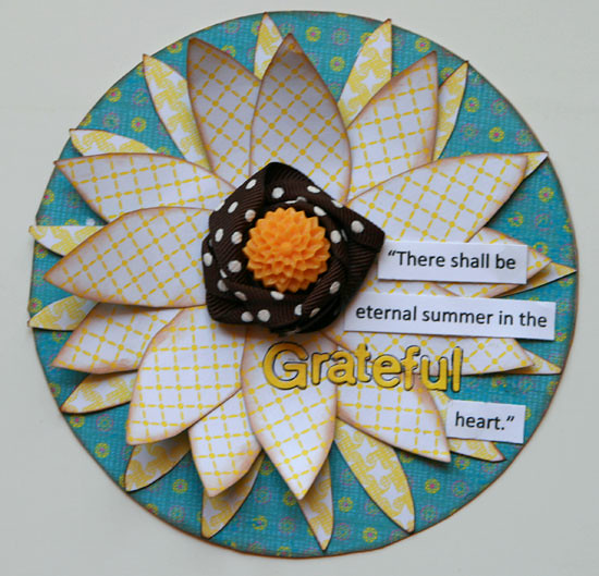
I created this sunflower card with a circle background, then glued down the flower base with a second patterned paper, and cut more petals with the third patterned paper. I inked all of the layers, then added the quote and twisted the ribbon around the center of the card. The little yellow flower Cabochon from the Fun House collection gave it the perfect finishing touch! :)

IMG_0420web

IMG_0418web

Supplies:
patterned paper - GCD Studios
Cabochon - GCD Studios
letters - Basic Grey
ribbon - American Crafts
ink - ColorBox

Photobucket

6.05.2011

Inspiration found on the internet

Hello! Leslie here again today to share my technique which highlights the use of inspiration found on the internet to spark your creative energy. I recently have become a big fan of Pinterest. Soon after I joined, I found this fun and totally hip image in a home decor pin.


I originally pinned this image because I thought it was such an innovative take on a gallery wall. Later, I thought this design would be fun to interpret into a scrapbook page. Here's what I came up with.


Close up you can see that I decided to just rub ink on the chipboard pieces, so that they would be black but still show up on the black cardstock. I added some great chipboard and brad embellishments, also from the Soul Food line for some color and added interest.


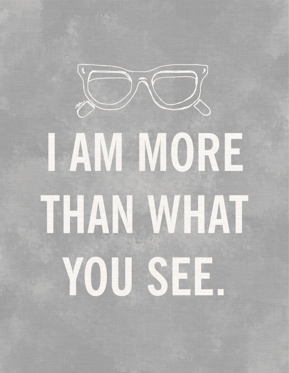
I also had a pin for this illustration on my board.


I thought using this as a title was a perfect play on words for the story I was telling. The story starts with the photograph of our daughter looking great in her new glasses, so obviously, she is seeing more clearly now. The heartfelt journaling goes on to remind her that her true beauty comes from the inside, not what people can't see at first glance.


I hope this encourages you to poke around Pinterest, if you haven't already, to find and collect, beautiful, inspiring things that might give you that creative boost you need next time you sit down to scrapbook.