2.18.2013

Look No Farther Indian Summer Is Here!

 I love happy colors. I love bright, and pale, happy and toned down. Most of all, I love a paper collection that gives you all of these, which is exactly what Indian Summer does.


Somehow it manages to make these colors bright, but soothing, and the patterns, Rose Garden, Modern Chevron, and Happiness all blend together so well on Maria Floral.


If you're looking for that perfect all occasion paper pack, look no farther than Indian Summer!

Thanks for stopping in with me today!

Blog: bearydocardsinc.blogspot.com

2.17.2013

Ten Reasons

As a mother to boys, this line has to be my absolute favorite new collection! From airmail stripes to retro images, and even florals to keep this girlie girl happy, Special Delivery is awesome! I created a "10 Reasons I Love You" page:


Using instagram photos that my little guy and I took early one morning (yes, that is me without any make-up and before I even took a brush to my hair!), I adopted a grid pattern for my page.


Using bits from "Stamp Collection" and "Jack", I filled the grid with rectangles and photos, journaling and accents.


Special Delivery was a lot of fun to work with and one collection I will return to again and again to record memories of my boys.


GCD Studios Supplies Used: Jack #2043, Scott's Stamp Collection #2046, Calvin's Race #2039, George #2037.

2.16.2013

Just Roll With It

Hello there!

Today I'd like to share a little something I made with one of may favorite new collections from GCD Studios "Sunkissed" by Heidi Sonboul

Supplies:
Cardstock:  (white) Georgia-Pacific, (pink) American Crafts, Patterned Papers: (Lazy Days, Swim Lessons, Pretty Swimsuit, Pool Party Baby!, Sunshine from the "Sunkissed" collection) GCD Studios, Stamps: (Just Roll With It from the Spiffy Scooters set) Paper Smooches, Ink: (black) ColorBox, Twine: Jillybean Soup
Size: 5.5"x4.25"

Sunkissed is all about delicious sherbet-y colors and fun summertime elements like roller skates and  bathing beauties. I couldn't resist making the roller skate cut from the "Lazy Days" paper the focal pint of my card. I embellished it with a few flowers and matted it with the fabulous star from the "Swim Lessons" B side. With a background of multi colored triangles, I love the way this card turned out!

What do you think?

2.15.2013

Made Fresh


With a new year comes new things in blog land, and Branch Out Designs is no exception when it comes to starting new. This year you're going to find great new series, full of fresh ideas and content. Even better you'll be able to learn tips, techniques and ideas to jumpstart your creative juices and branch out from the same ol same ol.

Today's post is the first day of a series that focuses on fresh ideas for your card-making featuring paper from GCD Studios new 2013 collections. Four of the cards that you'll see were featured at CHA, and I have two bonus projects to also share with you. I have never seen my projects at CHA, so it was really fun seeing them display beautifully at the booth.

This card is chic and modern and super simple to make. The use of blue and orange is striking, taking a homespun collection like Pure Bliss and giving it a fresh, clean and chic look. Two steps and you have pure bliss in a card.

|1| Cover your card with patterned paper and tape on the edges.

|2| Die cut letters from cardstock, and adhere pieces to letter openings to give a pop of patterned paper.

Now wasn't that easy? Have fun playing with this collection on your own. You're going to love the soft colors, muted patterns and totally adorable embroidery hoops! Join me again tomorrow for another fresh card, delivered straight to you.

materials


2.14.2013

The February Issue of The PaperCut

After working on it for a couple of weeks, it's finally ready for you. It's packed with projects and the cover is my new favorite.

 photo GCDStudiosThePape4E4A31_zpse890a73c.jpg

I had so much fun photographing this set and hand placing each little dot.
Now check out the issue and make sure to tell us what you love.
~H


Happy Valentine's Day And A Layout

Hello and Happy Valentine's Day!

It's Wendi here and I'm sharing a layout about a very special little lady in my life. I used the gorgeous Charleston line, which was completely perfect for my baby girl layout of my little one. When I opened the papers, I was totally smitten with this line. The colors and patterns in this line are so soft and sweet and perfect for Love.

Here's my layout:
When I saw the patterns of this line, I instantly thought of replicating a quilt pattern on the page. I cut out my squares and triangle pieces:
Next I laid them out in the pattern on the layout at the top of the page:
Then to finish out my "quilt" I machine stitched across the pattern:
I had cut out a heart and added some stitching to it also:
I also used the large flower Roaring 20's paper to fussy cut the flowers and then added some Glossy Accents:
And there you have it... 

Have a wonderful day.
Supplies:
Paper: Charleston Collection-  Roaring 20's, Charleston Plaid-Light, Jazz Age-Tan, Starry Night, Flapper.
Other: Alphas, Machine Sewing, Twine, Crackly Glossy Accents, Scallop Border Punch.

2.13.2013

Just a Couple of Cute Cards

Tracy Schultz Happy Fall GCD

 I think one of my favourite collections GCD showed off at CHA was Nostalgia. I love the combination of green, pink, orange, and yellow. Not to mention the fun patterns! For my first card, I wanted to make it a little more masculine and fall-inspired. Tracy Schultz Happy Fall close-up GCD

I focused on the lovely green striped paper and just added small squares of some other patterns to make my card pop. I rounded the corners so my card wouldn't look so sharp. Then finished the whole thing off with a tiny felt leaf and my sentiment. [Supplies: GCD Studios Nostalgia collection; Stamps- CSS Fall Frenzy; Ink- Dish All the Dirt Brown; Accessories- corner rounder punch, paper piercer, Copic Multiliner .3 black, yellow felt, CSS Leaflets die-cut, CSS Favor Flags die-cut]
  Tracy Schultz True Love GCD
 This love card was a ton of fun to make! I would never think to combine these colors together, but I was inspired by that plaid paper and just went with it.
  Tracy Schultz True Love close-up GCD

 I added a little bit of piercing to the pink layer for interest. The sentiment and flower border is from this collection, too! [Supplies: GCD Studios Nostalgia collection; Accessories- corner rounder punch, Jillibean Soup yellow twine, Maya Road heart trinket pin, light orange felt, CSS heart die-cut, paper piercer]
 

2.12.2013

Love Him


Ahhh....oh yes, this collection is Pure Bliss!  Put that one right in my stash, thank you!  Guiseppa here, to share with you a layout I made using the new Pure Bliss Collection by Heather Tozzi.  What I love about this collection is those embroidery hoops...aren't they fantastic.  Well, the whole collection is, it all fits.  Here is what I did. 


Ok...so I love my hubby and this collection is perfect for the ones you love.  I used some craft colored cardstock on this layout.  I cut the hearts out of it and backed it with some of the patterned papers from this collection.


I also cut out tree limbs with leaves in both craft and white and decorated some of the leaves with the Pure Bliss patterned paper.  See...there are those cute embroidery hoops :) 


Of course, there I added foam adhesive...because that is just what I do, oh...and lots of layering.  I can't wait to play with this collection some more.  I have lots of people I love who would look so good on this paper.  Until next time!


2.11.2013

That Ampersand Paper

I think summer is my favorite time of year, and I always have a ton of photos of just doing everyday things, like blowing bubbles!  :)

The ampersand paper from the "Sunkissed" line was the starting point for this page, although the back paper reminded me of bubbles, so I had to use that, too! 


On the background, I used some punched circles, and some machine stitched circles as well, to add to the bubble theme.


I cut out the ampersand and outlined it with a black pen.  I used it as a spot to ground my title.   A few fussy cut flowers are scattered here and there around the page, too!


Thanks for stopping by!
-Audrey


Audrey Yeager GCD Studios DT, 2012 GCD Studios Layout Gal

2.07.2013

The Pretty Papers.

The Charleston collection is filled with soft neutrals, beautiful florals and versatile prints. The colors reminded me of wet sand and the setting sun, so I pulled photos of a recent vacation to the beach to pair with the pretty papers.


To enhance the sunset theme, I used my Silhouette Cameo to create a sunray design in my background cardstock.


I filled each ray with papers from the Charleston collection, then added stitching and gold airmail washi tape for even more texture.


The Charleston collection complimented my photos beautifully. I cannot wait to try these pretty patterns and colors on layouts with other themes. My thanks to Diane Kappa for designing such a special collection!


GCD Studios Supplies Used: Criss Cross #2007, Flapper #2008, Jazz Age Tan #2004, Look #2000.

2.06.2013

From the 1800's to 2013

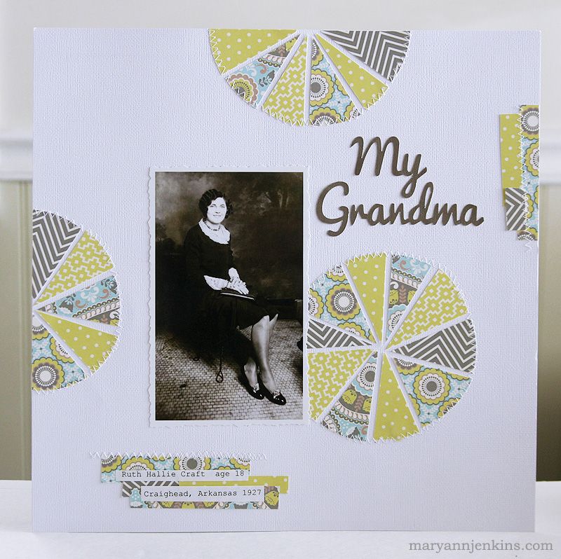
Hi friends! Today I have a layout to share made with the brand new Nostalgia collection.

Nostalgia is perfect for those old black and white heritage photos ( like I used on my layout) but would work just as well with photos from 2013 too!
For my layout, I used 4 different patterns from the collection, and cut a 4" circle from each piece of paper. I then cut each circle into "slices" just like you would a pizza. Next I put the circles back together, mixing in the various patterns. A few extra left over strips of paper, a title, journaling, and some machine stitching and my layout was done!

Thanks so much for stopping by the GCD Studios blog today!!!

2.05.2013

In The Details.

Is it bad that I missing having an infant because I just love infant photos so much???  Especially the black & whites.  This photo is almost 2 years old, and I love the little details of a baby.  All the wrinkles and bumps and soft fuzz...*sigh*


I cut out the pod shapes from patterned paper from the "Indian Summer" collection and arranged them on my page.  Then I machine stitched around them following the layout of the shapes.


I fussy cut a whole bunch of flowers and cut some stems with my die cutting machine.  I folded them and layered them to give them dimension.


Some simple journaling strips that I cut into banner shapes and outlined with a thin black pen.


Thanks for stopping by today!
-Audrey


Audrey Yeager GCD Studios DT, 2012 GCD Studios Layout Gal

2.04.2013

A Nifty Little Trick I Learned- Stamping

Hello there! My card today uses the adorable Nostalgia collection by Diane Kappa aaannnd a nifty little trick I learned in the making!


I had assembled my papers, Plaid Blue, Floral Tile, and Olivia, when the critical moment came for stamping. I stamped my 'hello' on the Nostalgic cutout, but the image wasn't crisp! Simply put, I freaked - I only had one copy of the paper! What to do?! I tried shifting the paper around, but nothing worked.
Then, on accident, the answer presented itself in the form of my messy desk.
Whenever I'm not sure what image/sentiment I want to stamp on a piece of paper (especially my prized paper), I always like to stamp it first on a piece of clear wrap (like the kind embellishments are packaged in) with permanent ink, then cut it out, and place it over my card so I can get an idea of what that stamp would look like. I did it with this card, and that little test stamped 'hello' was floating on my desk when it caught my eye.
I trimmed it as close as possible, then used some vellum adhesive to adhere it over my stamped sentiment on the paper. Oila! The blotched impression is fixed!


A little bit of glossy accents make this 'fun' sentiment (sorry, couldn't resist ;)) pop out!

Thanks so much for stopping in with me today!