Hi it is Kim here to share with you a technique for creating texture on white core patterned papers.
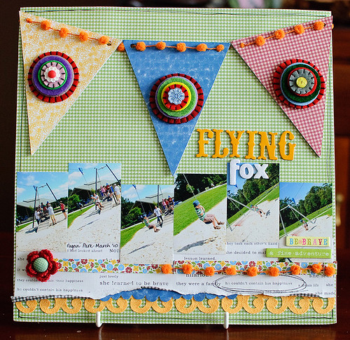
I am not a big user of plain pattern papers and when I was working on this layout, I wanted a way to "dress up" the plain blue paper that I really wanted to use on one of the pennants.This is the layout ...
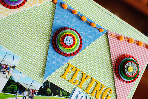
and this is a close up of the pennant in question ...
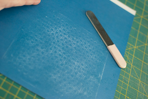
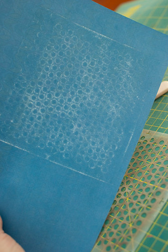
The paper was originally a plain blue paper and by putting a plastic template under it and sanding it with a large emery board, I was able to create a soft polka dot design on it. It is so simple but effective!
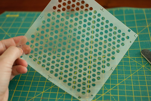
Step 1 : select your template, I chose a dotty one
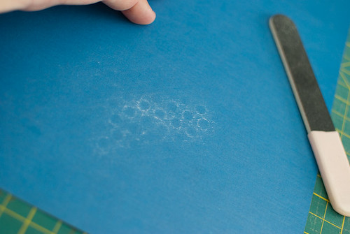
Step 2 : place under paper and holding paper in place sand across the surface of the paper.
Step 3 : you will end up with this type of pattern!Step 4: use your paper however you want - I chose to cover one of the large chipboard pennants from this set and then use it in the super sized pennant banner at the top of the layout. It is a great way to bring new interest to a plain piece of white core pattern paper
All of the GCD papers and embellishments in this layout came from Artsy Urban, with a touch of Homespun Chic and Zippity Collection.
Other products: Thickers by American Crafts, bauble ribbon from stash.I hope you have an opportunity to try out this easy but effective technique soon to make a change to a piece of patterned paper in your stash!
Cheers
Kim :o)

What a great idea and thank you Kim for sharing this with us!~!!
ReplyDeleteFAbulous lo and fabulous tip! LOVIN' that banner!
ReplyDeleteGreat tip! Love your layout!
ReplyDeleteCute layout! Love that tip:)
ReplyDeletelove how u used the banner on a layout !
ReplyDeleteWhat an awesome l/o!! LOVE the banner!!
ReplyDeleteI've never thought of trying this! So fun! and I just love that banner on your LO!!!!
ReplyDeleteLove the banner big time!
ReplyDeleteKim, this is beautiful, that big, bold banner is so fun! Love the tip!
ReplyDelete