Hi there GCD Blog readers! Hope your autumn days are cooling off and you are finding time to enjoy the fall weather. I know I'm ready to enjoy some quiet evenings on the back patio.
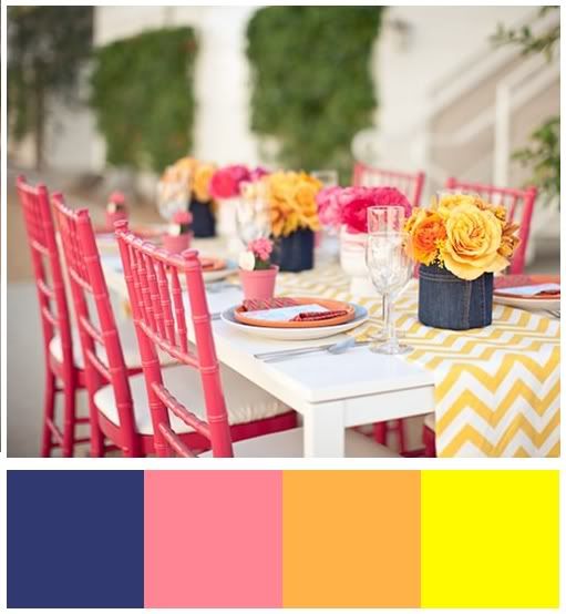
My color inspiration layout for this month came from this beautiful outdoor place setting.
I thought it was a fresh mix of colors and not a combination I would have chosen naturally. But as luck would have it, it turned out to be the perfect color combination for my daughter's back to school photo.
To create the page, I began pulling out all my GCD Studios papers and embellishments that were in the color palette and fit the theme of my page. After that, the page just came together rather quickly.
As I often do, I created a portion of my title on a little chipboard plaque. It keeps the title from floating on the page. I just love all the different styles of plaques by GCD Studios. I really could find a use for them on every page I make.
I like to keep the colors fairly evenly dispersed around the page to create a sense of balance. The metal rimmed glass brads are perfect for spreading that perfect little hint of color. Love them!
Here's another look.
Supplies:
Patterned Papers: GCD Studios Soul Food, GCD Studios Animal Crackers for Girls, Studio Calico
Embellishments: GCD Studios Soul Food border strips, chipboard word plaques, metal rimmed glass brads, metal rimmed clips, inspiration card.
Transparency: Hambly; Letters: American Crafts and Basic Grey
See you again soon! my blog


Wowwwwwwwww! This is BEAUTIFUL! I loveeeeeeeeee how you split the design down the middle! :):):):):):):):):):):)
ReplyDeleteI love your back to school layout! I especially love you hand-written list that shows her getting off to a great start too!!! Very cute layout!
ReplyDeletee.
Love your layout, Leslie!
ReplyDeleteTeri