
It's Heidi again and man oh man do I have another YUMMY inspiration for you this month! Danielle Thompson has been inspiring us crafty ladies for a while now and when I saw this on her blog... I went nuts over it! The colors are amazing and so perfect for fall!
Now take a look and see how our two designers Gina and Tessa used this inspiration. It's good!

Up first the lovely Tessa Buys:
I love the traditional colors of fall, but throw in a juicy pink and pretty blue and I'm swooning!
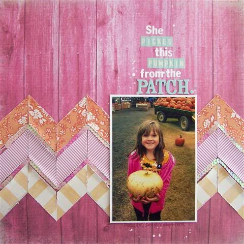
The pink barn wood paper from the Spring in Bloom Collection by Donna Salazar was the perfect backdrop. I went with a trendy chevron pattern that I learned how to create here. Notice how I put the orange at the top (like the pumpkins in the cart), pink in the center (like the sweatshirt), and yellow at the bottom (like the pumpkin she's holding)? The colors of the design flow right into the photo and back out again.

To add interest to my chevron pattern, I tucked a string of sequins between each row. Distressing and bending the papers gave the sequins a chance to peek out.

I used the blue from the palette for my title so that it stood out from the other bold colors. I love the look of mixed alphas and used three different alpha styles for my long title.

When you scrapbook your pumpkin patch outing this year, don't be afraid to stray from the traditional orange. Throw in some pink or aqua for a fun take on a fall palette. Thanks for stopping by today!
 Now for our sweet Gina Lideros and her beautiful layout:
In the month of October there are many photo opportunities to take pictures of the kids in Halloween costumes, pumpkins and fall decor. These colors are so vibrant and fun. Once I saw these colors, I knew that I had the perfect photos to go with them.
I have these photos of my daughter in her "Mad Hatter" Halloween costume last year. Her costume was so bright and cheery that I wanted to use bright colors to accentuate the photos instead of traditional Halloween colors. The papers from the Fun house and Youthful Eggsubarance collections matched perfectly. Mad Hatter layout:
 Here is a detail shot:

I handcut the target symbol then used a star punch to dress it up. I added chipboard flags and twine from the fun house collection. I decided to do a fun journaling spot clustered with tickets to carry the "fun house theme"
 To complete this project I used papers and embellishments from the Funhouse collection, and the youthful eggsubarance collection.
 I hope this layout inspires you to scrap those Halloween photos using non- traditional colors.
Yummy, right?! This palette is perfect for a snapshot I took while at the pumpkin patch last fall:


To add interest to my chevron pattern, I tucked a string of sequins between each row. Distressing and bending the papers gave the sequins a chance to peek out.

I used the blue from the palette for my title so that it stood out from the other bold colors. I love the look of mixed alphas and used three different alpha styles for my long title.

When you scrapbook your pumpkin patch outing this year, don't be afraid to stray from the traditional orange. Throw in some pink or aqua for a fun take on a fall palette. Thanks for stopping by today!
In the month of October there are many photo opportunities to take pictures of the kids in Halloween costumes, pumpkins and fall decor. These colors are so vibrant and fun. Once I saw these colors, I knew that I had the perfect photos to go with them.
I have these photos of my daughter in her "Mad Hatter" Halloween costume last year. Her costume was so bright and cheery that I wanted to use bright colors to accentuate the photos instead of traditional Halloween colors. The papers from the Fun house and Youthful Eggsubarance collections matched perfectly. Mad Hatter layout:
 Here is a detail shot:
I handcut the target symbol then used a star punch to dress it up. I added chipboard flags and twine from the fun house collection. I decided to do a fun journaling spot clustered with tickets to carry the "fun house theme"
 To complete this project I used papers and embellishments from the Funhouse collection, and the youthful eggsubarance collection.
 I hope this layout inspires you to scrap those Halloween photos using non- traditional colors.
Now, wasn't that so fun? So next time you craft your fall photos, try this color inspiration and give your fall album a fashion new look and pop of color.
~H
These are GORGEOUS! :):):):):):):):):):):)
ReplyDeleteLove the idea of nontraditional colors for Halloween!!! Both pages turned out darling!!!
ReplyDeleteThese are both gorgeous layouts girls! I love how each of you ran with the color inspiration!!
ReplyDeletee.
I love that pink layout! Pink has a place in every holiday, well at my house any ways :)
ReplyDeleteLove these both, girls!
ReplyDeleteTeri